
Like almost everyone else, I am now hunkering down in my house doing the “social distancing” thing. Since the announcement of the first confirmed coronavirus cases in Austin Thursday night (less than four days ago), events have been accelerating almost as fast as the virus has been spreading. My kids are on Spring break, but I doubt they will be going back to school next week. The supermarket shelves are getting bare. I work from home anyway, so that is no change for me.
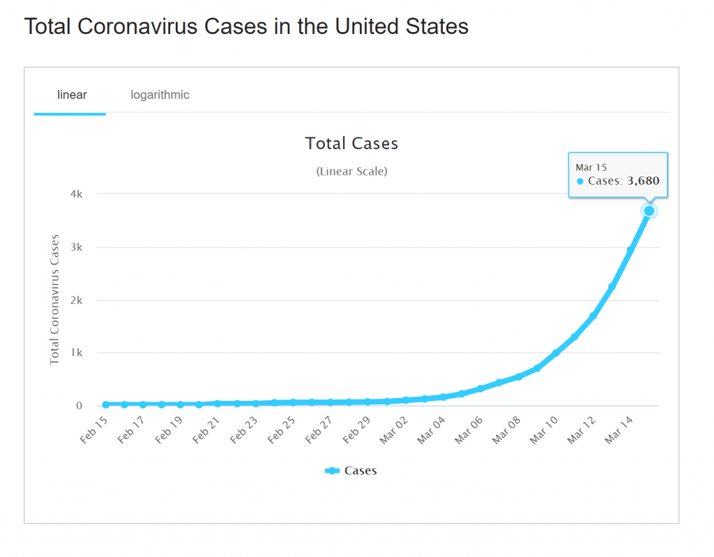
Like everyone else, I am consuming the news about the spread of this disease. But as a data geek, I want more than what you find in the newspapers (yes, I’m old school – news is something you read, not something you watch). The first obvious place to go is the CDC website. Their data is perhaps the most trustworthy, but also conservative and a few days old. There is also the more accessible Worldometers site, with very up-to-date numbers that may be less reliable than the CDC (though I am not diving into that). Below are a couple of links and graphs from those sites. The bottom line: the number of cases in the US seems to be doubling every four days. That’s a 10X increase every two weeks. Exponentials – yikes. If we don’t flatten this curve, that will mean 400,000 cases in a month, and the entire country in two months. It is time for us to flatten the curve.
https://www.worldometers.info/coronavirus/country/us/
https://www.cdc.gov/coronavirus/2019-ncov/cases-updates/world-map.html
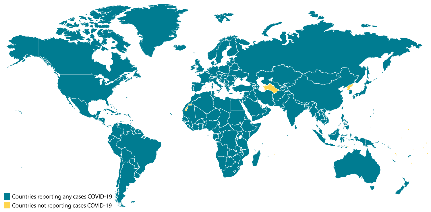
(Countries with coronavirus cases shown in green, as of March 14.)
You can likely develop your own, but here is an epidemic modeler: https://gabgoh.github.io/COVID/index.html